Sunday, December 11, 2011
Friday, December 9, 2011
Iconography 5
Iconography 4
"The Downfall of Adam and Eve and their expulsion from the Garden of Eden," is part of Michelangelo's paintings in the Sistine Chapel. Painted during the years of 1508 to 1512, he was commissioned by Pope John Paul II to create the artwork for the ceiling panels. Depicted here is a combination of scenes which tells the story of Adam and Eve as they take the apples from the tree against Gods word, and become banned from the Garden of Eden for life. Along with this panel, Michelangelo created many other paintings that represented historical biblical stories.
Monday, November 28, 2011
Iconography 3
“Portrait of Napoleon Bonaparte, The First Council,” was painted by Jean Auguste Dominique Ingres in 1804. This painting was created on commission for the Emperor himself Napoleon Bonaparte, which was promised to the citizens of Liege, Belgium as a sign of appreciation, after the struggles of the Austrian Bombardment. In this painting, Ingres had to base Napoleons pose off of a painting done by Jean – Antoine Gros, because he could not get him to sit for his own portrait. In the painting he is depicted as an officer doing his duty for the people in order to rebuild their city.
Iconography 2
“Girl with a Pearl Earring,” was painted by Johannes Vermeer in 1665. This painting is quite simple in its composition. It is simply a girl with a pearl earring, with the earring being used as the focal point. Unfortunately, very little is known about this painting. It is unsure if it was painted as a commission and if it was, whom it was for, but either way, it was not meant to be painted in the style of a conventional portrait. This painting is often referred to as “the Mona Lisa of the North” or “the Dutch Mona Lisa.” From more recent studies it is thought to be what is considered a “tronie,” which is a 17th century description of a head that was not meant for a portrait. In more recent times, both a novel, and a movie have been created which may add a possible background story to the painting.
Iconography 1
“The Brigadier,” was painted by Lucian Freud in 2003 – 4. It is a painting of an English Military man named Andrew Parker-Bowles wearing full uniform, with his medals clearly being accentuated on his chest. This man was a friend of the Prince of Wales. At first glance it seems as if the painting belongs with traditional portraits of Military men by artists like van Dyck and Sargent, but on second look, you get a sense of manhood that puts the figure in a nobler type of portraiture like those of Rembrandt and Goya.
Friday, November 18, 2011
Foreground, Middle ground, Background: The foreground of a composition is the visual plane that appears closest to the viewer, while the background is the plane in a composition perceived furthest from the viewer. The middle ground is the visual plane located between both the foreground and the background. Claude Monet's "Jardin à Sainte Adresse," 1864, clearly shows the people and garden scener in the foreground, the ocean and closer sailboats in the middle ground, and the much smaller sailboats in the background.
Picture Plane: In painting the picture plane refers to the flat surface of the canvas or the physical material onto which the paint is applied. An interesting example is Henri Matisse's "Red Room." 1908. In "Red Room," the entire picture plane is used and Matisse really flattens the image by using such a bright dominant color.
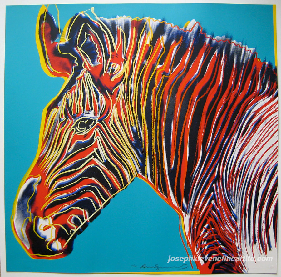
Post Modernism: a term used to describe an art movement which was thought to be in contradiction to some aspect of modernism or to have emerged or developed in its aftermath. In general, movements such as Intermedia, Installation Art, Conceptual Art, and Multimedia, particularly involving video are described as postmodern. An example would be Andy Warhol's "Grevy's Zebra." 1983
Modernism: its broadest definition, is modern thought, character, or practice. More specifically, the term describes the modernist movement, its set of cultural tendencies and array of associated cultural movements, originally arising from wide-scale and far-reaching changes to Western society in the late 19th and early 20th centuries. An example would be Hans Hoffman's "The Gate." 1959 - 1960
Cross Hatching: cross hatching is an extension of hatching, which is the use of fine parallel lines drawn closely together, to create the illusion of a shadow. Cross hatching is a layering of two hatchings at right angles used to create a mesh like pattern. Shown here by Rembrandt in a Self Portrait from 1630.
Iconography / Iconology: the branch of art history which studies the identification, description, and the interpretation of the content of images. The word iconography literally means "image writing". "The Last Supper," by Leonardo da Vinci is an iconographic image of Jesus telling the apostles that one of them would betray him. 1495 - 1498
Thursday, November 10, 2011
Matisse Model
In this piece Matisse seems to be attempting to do the same thing we are doing in class. It seems as though he is not only focusing on the model, but also the space around her. By doing this he is able to experiment and create the correct proportions. By looking at this painting, it makes me feel better about my own work. The reason is because this piece does not have that "perfect" artist feel to it. Rather, it has places where the proportions do not seem to be perfect, and other places with minor distortion. For example, the models hip seems to jut out more than it actually would in reality.
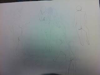
Nude Sketches Day 3
From the third day of sketching with a model, I feel that my last drawing worked out best for me. At the beginning of the period I really wasn't happy with the way my sketches were coming out, but they got a little better each time. I would say that the toughest part of sketching today was that in most poses, the model's position created a large amount of foreshortening. This made it really tough to truly capture the proportions, and place the model in the space. In a way, it felt as if I was distorting the figure in my sketch, but after it was all said and done, it seemed to be correct.
Sunday, November 6, 2011
Hans Hoffman - "Landscape"
The two quotes that I feel apply well to this painting are, "It is not the form that dictates the color, but the color that brings out the form." As well as, "The whole world, as we experience it visually, comes to us through the mystic realm of color." The first quote works well because Hoffman clearly uses color to abstractly create the form of a landscape. The second applies because he is speaking of visualizing the world, and in the painting he is creating the abstract form of the landscape, which goes hand in hand with visualizing the world.
Wednesday, November 2, 2011
Nude Sketches Day 2
This set of sketches comes from our second week of practicing with a model. A different model was used but the same goals applied. We continued to work on setting the proportions of both the space and the figure in the space. During this class we also discussed Hans Hoffman and some of his theories. A quote from Hoffman, "Being inexhaustible, life and nature are a constant stimulus for a creative mind." I feel that this quote applies to working with a nude model because in a sense, the nude model is the essence of both life and nature, and when working with the model there are numerous positions and spaces to recreate.
Classroom Still Life
Here is a sketch of a still life that was set up in class one day. The point of this was to layout the proportions of the entire space first, and then little by little, recreate what was seen.
Wednesday, October 26, 2011
Nude Sketches Day 1
These sketches are from our first day with a model. The first ones are the sketches that were done in a very short amount of time, and as you move further down to the other sketches, the time spent working was lengthened a bit each time. The focus for this day was to capture the proportions of a nude body, while also proportionally placing them in the surrounding space.

Continuation of Day 1
A continuation of the sketches from the first day. This is two views of the same sketch, one closer up, and one farther away. This sketch was also the longest of the day, which was about an hour of working time.
Thursday, October 20, 2011
Cezanne Quotes: Sketch 3
The last quote I chose to illustrate was, "I am old and ill, and I have sworn to die painting." After doing a little research on Cezanne himself, I found out that painting was in fact the last thing he was doing before being bed ridden and dying a few days later. I thought that this was kind of ironic so I decided to make my own depiction of the quote. The quote states that Cezanne wanted to die while he was painting, so in my sketch I created a kind of foreshadowing of the end of his life. I created a sketch that depicted Cezanne creating a painting of his own grave stone, in which he "dies" before he could finish his last name on the grave stone.
Cezanne Quotes: Sketch 2
The second quote I chose was, "The contour eludes me." This sketch is a little more abstract than the first in comparison to the quote. After thinking a bit about what could be used to represent this quote, I thought what better than the NYC Skyline. The reason for this is because when we view the skyline, the contour does in fact elude our eye. When looking straight across the river it is hard for one to tell where the edge of one building ends and where the next begins, and for this reason, we have trouble making out the contour of each building. On the other hand, when the sides of the buildings seemingly "blend" together into one object, it creates a new contour, which is known as the famous New York City Skyline.
Cezanne Quotes: Sketch 1
The first quote I chose to sketch was,"It's so fine and yet so terrible to stand in front of a blank canvas." In this sketch I went pretty literal according to the quote. The reason for this was because I felt that the image would go along with the strength and meaning of the quote. The sketch is simple, a man, standing in front of what is an oversized canvas. The reason I made the canvas larger was to emphasize the importance of the quote. It is so fine to stand in front of a blank canvas because it provides you with all of the opportunities in the world. It allows you to take advantage of everything in your life. On the other hand it is terrible to stand in front of a blank canvas because sometimes we are unsure of what to do or think, or what comes next in our lives. At times a blank canvas could represent the daunting fear of what the future could hold, or it could represent the lack of effort or creativity in life's tasks.
Sunday, October 2, 2011
Hand Sketch
Not much to explain here. Just a study of my own hand holding my iPhone. First I attempted to block out the hand geometrically, and then I went on to work with the proportions. After sketching everything out, I went in to work on the shading and the details of the hand. I used a combination of hatching, cross hatching, bracelet lines, and some normal shading to create the form.
Monday, September 26, 2011
3 Pt. Perspective - Building Scene
My favorite of the perspective studies, this building scene was created using three point perspective. The two lower points are created on the same line, while the last point is created in between the two, but on another line, which in this case was higher. This one was a little tricky to follow, and work through in order to figure out which lines would go to which point. After figuring out where the lines lead to, the rest of the sketch fell into place on its own.
2 Pt. Perspective - Boat Wheel
This boat wheel was created using two point perspective. Two points placed on both sides were used to create the outer limits of where the wheel would be. Then the dimensions were boxed out and the wheel was drawn based on the perspective lines and the box proportions.
1 Pt. Perspective - Figures
Another study done in one point perspective. In an attempt to work with the proportions of the human body, I followed an example of how to create them in one point perspective. As the bodies get closer to the point of perspective, they proportionally get smaller and smaller, which can be used to help create an illusion of depth in drawings.
1 Pt. Perspective - Buildings
A simple study done in one point perspective. Architecture is an easy way to develop the use of perspective lines. The lines in the buildings, all lead to a single point of perspective which is theoretically off to the right of them.
Monday, September 19, 2011
Dark Sketch / Erase
This drawing was based on some of the techniques used by Francisco De Goya in his "Los Caprichos" drawings. The idea was to create the dark areas first and then erase and find an imagined figure. Although I did not totally go about it that way I am pleased with the outcome. First I sketched out the proportioned figure lightly and then began to make the darkness around them. I then continued to create mostly darks areas on the page, except for the two light sources which are the street lamp and the moon. Other than that the dark areas were created by shading, burnishing, and a little bit of hatching and cross hatching. From these techniques I was able to create an outdoor night seen with a somewhat "imaginable figure" looming on the streets, not to mention the erie shadow to the left of the figure that was created unintentionally.
Subscribe to:
Comments (Atom)


